Lens
When to use
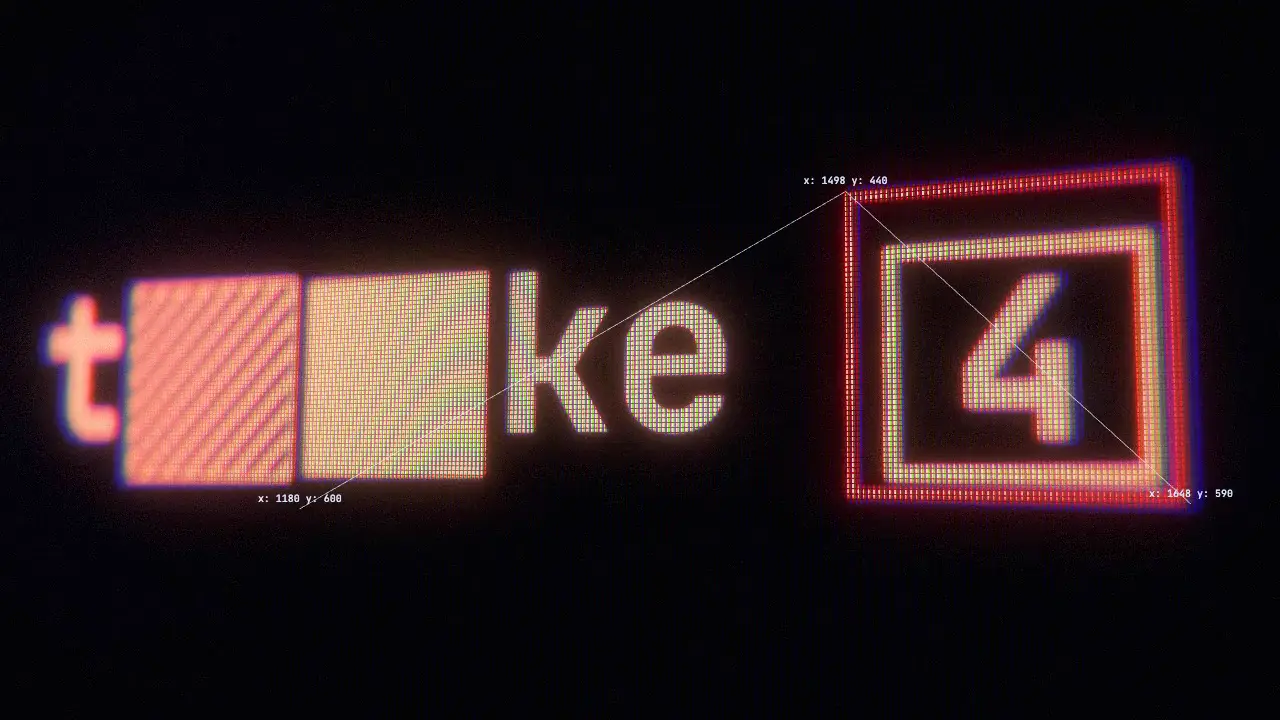
Use when a screen (a terminal, a dashboard, a tracking HUD, a type line shown as a monitor) must read as a real object filmed by a camera: tilted, soft at one end, bright glyphs blooming, LED cells and colour fringes visible when the camera pushes in. Render the flat screen, then let one shader film it. Clip: lens.mp4. Demo: demo/lens.html. Code: core/surfaces/lens.js.
The six stages of the clip, each turned on for one second: flat, perspective, depth of field, palette and aberration, bloom and LED grid, tear and grain with the camera tracker.
The code
import { lens, htmlSource, PALETTES, OFF } from '/core/surfaces/lens.js';
const cam = lens(htmlSource(document.getElementById('screen'), { scale: 2 }), {
  aim: (t) => [1390, 520], zoom: (t) => 1 + 1.9 * ease(t), tiltY: 0.38, tiltX: 0.1,
  dof: { blur: 0.55, focus: [1400, 520] },
  palette: { stops: PALETTES.thermal, keepColor: 0.9 },
  bloom: { strength: 0.9, radius: 42 }, grid: { amount: 0.9, cell: 3 },
  aberration: { amount: (t) => 6 + 8 * lock(t) },
  tear: { amount: (t) => (hit(t) ? 70 : 0) },
});
vawe.onFrame((t) => cam.draw(t));            // the seek awaits it
const p = cam.project(1498, 440, t);         // { x, y, scale, depth, visible } in CSS px: put a label there
Easing and timing
The clip runs 6 s. The look is vawe.
Notes
What it does
- The screen is
#screen: plain HTML and CSS, 1920 by 1080 px, parked behind the lens canvas.htmlSourceinlines its computed styles and fonts into an SVG image and uploads it every seek.canvasSource(canvas)takes a 2D canvas instead. - Every option is a literal the page can change: a number, an array, or a function of the seek time. The defaults are the "filmed screen" look;
OFFflattens every effect so one can be turned on alone. perspective:tiltX,tiltY,roll,zoom(up to about 3),aim(the source point at the middle). A ray hits a tilted plane, so the far side is smaller and softer by geometry, not by a CSS skew.dof: blur grows with the depth difference tofocus(a source point: pass a function to follow a target). Bokeh takes the aperture's shape:blades(n-gon),rotation,roundness, andcatEyesqueezes it toward the frame edge. Bright pixels weigh more in the taps.softis the lens floor.palette: brightness through 2 to 8 colour stops (PALETTES.thermal phosphor amber navy paper mono).keepColorleaves saturated marks (a red lock box) in their own colour.- Light is linear from the first tap to the last pass.
gridis a panel mask on the screen plane: a soft dot per subpixel (layoutstripe, triad or dot,softness), the same shape per channel so the average colour stays untinted. It follows the plane (period changes with zoom and tilt), fades out of focus, and is applied before bloom, so bright dots bleed into each other. bloom: soft-knee threshold, then a 6-level downsample and upsample chain weighted byradius: a tight core plus a wide tail.aberration: red and blue move apart radially,amountpx at the edge.tear(rows slide, seeded),grain,vignette,exposure,lift,fade. All noise is hashed fromseedandfloor(t * fps): a frame is a pure function of t, so renders match byte for byte.project(x, y, t)is the same camera on the CPU. Labels, links and brackets drawn in HTML on top of the canvas (z-index above 0) stay sharp and show real source coordinates.
The numbers
The demo was measured against a reference, 1080p: bloom 90 to 10 percent width 24.9 px (reference 20.7), panel period 6.9 px (reference 7.1), colour fringe 35 percent of edges off by 1 px or more (reference 20 to 28). At 1080p a frame costs about 17 ms on the GPU (12 ms in a draft), and a 6 s final (360 frames) captures in about 20 s.
Rejected approximations
These faked one effect per element and never matched a camera:
text-shadoworfilter: drop-shadowas bloom: the glow follows the glyph shape, ignores the rest of the frame, and cannot be lifted by what sits next to it. Usebloom.- A repeating-gradient overlay as the pixel grid: it does not follow perspective, does not fade out of focus and tints the average colour. Use
grid. - One
filter: blur()as depth of field: a uniform blur has no depth. Usedofover a tilted plane. - CSS
transform: perspective() rotate3d()on the screen: a skew of the layer, one blur per plane, sharp text on the far side. UsetiltX,tiltYandzoom. mix-blend-modecolour layers as a palette: usepalette.
Never lose the screen
A tilted plane can swing its border into the frame or turn away from the target. edge: 'extend' (the default) repeats the screen's edge pixels past the border; edge: 'black' shows outside. fit moves the camera instead: fit: { keep: [x, y], margin: 80 } pans (then zooms out) until the point holds inside the frame, and cover: true until no border shows. cam.project(x, y, t).visible and cam.quad(t) (the four screen corners in CSS px) let a check warn when a shot loses its target.
Limits
htmlSource needs everything inside the screen to be self-contained: fonts from the page's @font-face, images and url() backgrounds are inlined; <video>, <iframe> and CSS counters are not carried. Set scale: 2 when zoom goes above 1.5, or small text turns soft. A page with a lens needs WebGL2.
Sound
Sound: a short noise tick at each tear, and a low thud on a lock (aberration peak). The lens itself is silent.
Related moves



See all 125 moves. Learn how a page becomes a film in the docs, copy chains of moves from the recipes, or read the motion guide.