Gooey filter
When to use
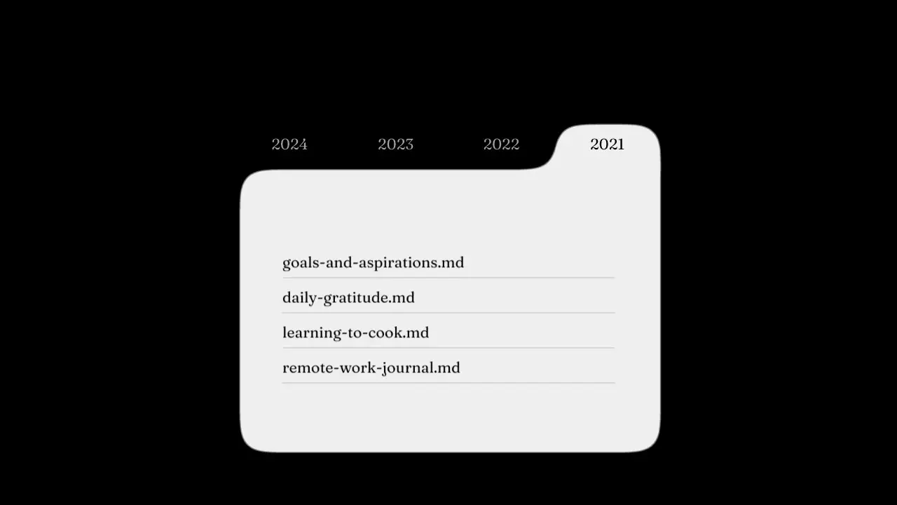
Use when a tab, a pill or a panel must melt into the next one: a tab bar whose active tab is joined to the page below it, a blob that stretches to a new slot, a menu that pours out of a button. Shapes that touch merge into one soft outline with rounded joins. Clip: gooey-filter.mp4. Demo: demo/gooey-filter.html.
Credit: port of fancy by Daniel Petho, MIT. Source: gooey-svg-filter (repo). The filter values and the demo are the original's.
Put the shapes and a filter: url(#gooey-filter) on one wrapper. Keep text that must stay crisp outside the wrapper: the blur would smear it. The filter blurs the shapes, pushes their alpha through a steep matrix (a threshold with a soft edge), then draws the sharp source on top of that mask (atop).
The code
<svg style="position:absolute;width:0;height:0"><defs>
  <filter id="gooey-filter" x="-30%" y="-30%" width="160%" height="160%">
    <feGaussianBlur id="gblur" in="SourceGraphic" stdDeviation="15" result="blur-sm"/>
    <feColorMatrix in="blur-sm" type="matrix" values="1 0 0 0 0  0 1 0 0 0  0 0 1 0 0  0 0 0 19 -9" result="goo"/>
    <feComposite in="SourceGraphic" in2="goo" operator="atop"/>
  </filter>
</defs></svg>
<div class="filtered" style="filter:url(#gooey-filter)"> tab row (one #efefef box slides) + panel </div>
<div class="labels"> the tab titles, no filter </div>
Easing and timing
The clip runs 3.6 s. The look is vawe.
Notes
const S = parseFloat(getComputedStyle(document.documentElement).getPropertyValue('--vh')) / 532;  // the original demo is 532 px tall
document.getElementById('gblur').setAttribute('stdDeviation', String(15 * S));   // filter px do not scale with CSS: scale them
const move = spring(t - clickAt, 171.4, 26.2);                  // the tab box: motion spring { duration: 0.4, bounce: 0 }
ind.style.translate = `${(from + (to - from) * move) * 100}% 0`;  // one box, equal cells: a pure translate
const u = cubicBezier(0, 0, 0.58, 1)(clamp01((t - clickAt) / 0.2));   // the page swap: motion "easeOut", 0.2 s
// leaving page: opacity 1-u, y -50*u, blur 10*u. entering page: opacity u, y 50*(1-u), blur 10*(1-u). Both at once, same spot.
The numbers that make it look expensive
stdDeviation15 (8 on a phone) for a demo 532 px tall: about 2.8 percent of the height. Scale it with the frame.- Colour matrix alpha row
0 0 0 19 -9: the blurred alpha times 19 minus 9. Keep both numbers. A smaller 19 makes a muddy, wide join. - The tab box moves 0.4 s on a critically damped spring (no overshoot), the page swap is 0.2 s
easeOut: the box lands after the text. - The filter acts on the whole wrapper: any text inside it stays sharp (
atop) but its edges are bound by the blob, so pad the text well inside the shape. - The label row is separate and switches colour at the click, not with the box: the new label is dark on the dark ground for a moment, as in the original.
- Give the filter a wide region (
x="-30%" y="-30%" width="160%" height="160%") and the wrapperwill-change: transform. The default region (10 percent of the wrapper box) cuts the blur, and on a page that two render workers share the outline then flipped 1.5 px between frames on a still shape. Both lines fixed that in the render.
The common mistake
Using a fixed stdDeviation on a large frame: the filter works in element pixels, so the same number gives a tiny join at 1080 p. Also putting the labels inside the wrapper (the threshold eats thin glyphs), and animating the filter itself: animate the shapes, never the filter values.
Difference from the original: the tab titles use Fraunces in place of Calendas, the cursor click is a time table (CLICKS), and the Safari branch (no spring) is not ported.
Sound
Sound: none; or a soft wet tick on each click.
Related moves


See all 125 moves. Learn how a page becomes a film in the docs, copy chains of moves from the recipes, or read the motion guide.