A motion design system: ten looks, 70 clips
Between 30 September and 1 October we re-rendered all 70 clips in the vawe moves gallery with a single motion design system: one shared foundation, ten token sets called looks, and one contrast check that every look has to pass. Before that, the library was a pile of clips that each had their own colours and type. The hardest rule to keep was also the smallest: a faint colour is for dots and rules, never for text.
The problem: a gallery that read like a pile
The moves library is the set of short, copyable animations an agent picks from when it builds a film (a card assembling, a count-up, a crash zoom). By the end of September it held between 53 and 70 clips. Each demo page had been written on its own, so the gallery had no shared visual language and read as a pile. That matters because the clip is the evidence for a move. If the look changes from clip to clip, a reader cannot tell which differences belong to the move and which are decoration.
The motion design system: one stylesheet, one attribute
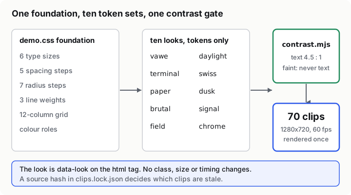
We did not start from a design tool. The demos are HTML pages, so the system had to be CSS. We put the foundation in prompts/moves/demo/demo.css and made the look a single attribute on the page: <html data-look="swiss">. No class, size or timing changes between looks. A move written for one look runs in all ten.
The foundation holds what every look inherits:
- Six type sizes as a share of frame height, so a frame at any size keeps its proportions: hero 18, title 11, head 7.6, lead 6, body 4.8 and small 3.8 (one
--uis 1 percent of the height). - Five spacing steps (
--s1to--s5, 1.2 to 7 units), one 12-column grid, seven radius steps and three line weights. - Colour roles instead of colours: ground, surface, raised, hover, ink, muted, accent and on-accent, plus a paper pair for a cut.
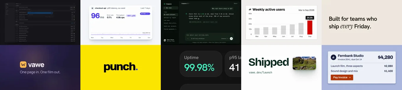
A look picks values for those roles and nothing else. The ten are vawe (cool near-black and cobalt), daylight, terminal, swiss, paper, dusk, brutal, signal, field and chrome. LOOKS.md gives each one a character and a job. Terminal is for typing and streams, paper is for quiet editorial type, brutal is for hits on the beat, chrome is for physical objects like plates and flaps.
The variety rule
Ten looks do nothing if every clip picks the same one. LOOKS.md carries a short assignment rule. Inside a group of moves a look appears at most twice, with an allowance for the biggest group. Adjacent moves in a group list differ. Product-UI moves take product looks, type moves take editorial looks, transitions take colour-led looks first. A physical move takes chrome and a typed stream takes terminal.
The rule keeps the gallery reading as ten systems. It also gave us a quick way to check ourselves: the assignment is one data-look per demo file, so a grep tells you the spread. Today 120 demos carry a look, from vawe at 22 down to brutal at 9.
The gate: faint is never text
Every look defines a --faint colour for dots, rules and icons. It is low contrast by design, so it must never carry words. We wrote contrast.mjs with the foundation (50aaa558c). It reads every look in demo.css and checks WCAG contrast: ink, muted, on-accent and paper text must pass 4.5 to 1, and accent used as text must pass 3 to 1 and only for large type. The follow-up commit (061b3aa23) wrote the rule into LOOKS.md: faint is for dots, rules and icons, never for text. It also made the check read short hex colours, and it darkened swiss's "up" ink, the red used for a rising number, from #d40500 to #c40400 so that it passes 4.5 to 1. Running node prompts/moves/demo/contrast.mjs today prints "10 looks, 0 failing pairs".
The same commit records which public skills shaped the pass and which parts we rejected. We used better-typography for measure, balanced wraps and tabular figures, better-ui for concentric radius and optical alignment, and baseline-ui for a spacing review. We rejected the 16 px body floor (a film sets its own sizes), the no-gradient and no-letter-spacing rules (several looks need both) and every hover and press rule (a film has no input). Writing the rejections down is what stops a later author importing the default again.
Render each clip once
A design system is only useful if it is cheap to apply to 70 clips, so the render step changed too. bin/vawe moves renders each clip once at 1280x720 and 60 fps. The size and rate are part of the clip's source hash, stored in clips.lock.json, so changing them marks every clip stale and nothing else. The script scripts/site/moves.mjs then derives the gallery copies: a 1280 H.264 file and a 1280 poster for the move page, and a 640 VP9 file and a 640 poster for the grid (7945d97b2). By default only stale clips re-render, and --all forces every clip (77a8d9147).
The measured result
All 70 clips were re-rendered with the ten looks (7bf0ce2c1). The pick-by-job table covered 53 moves (77a8d9147) and the render commit counts 70 clips. The contrast check passes on all ten looks.
What we did not measure is the cost saved. We expect the source hash to save render time, since only stale clips render, but we never timed a full re-render against an incremental one, so we do not quote a figure.
What we would tell someone building the same thing
Make the look data, not code. A single attribute that swaps tokens means a move never changes when you add an eleventh look.
Put the contrast check in the same commit as the tokens. A rule such as "faint is never text" is only a habit until a script can fail on it, and a colour change then has to pass it, as the swiss red did.
Write down what you rejected. The skills we pulled in came with defaults that did not fit a film. Naming them in the repo is cheap.
Keep the variety rule short and checkable. Ours fits in four lines and a grep. For the sibling problem of themes in reusable blocks, see headless blocks and themes. For the curve side of the same library, see easing as a vocabulary.
In the code
prompts/moves/demo/demo.css: the foundation and the ten token setsprompts/moves/LOOKS.md: each look in one line, plus the variety ruleprompts/moves/demo/contrast.mjs: the check across all ten looks50aaa558c: one design system with ten looks, a look assigned to every demo061b3aa23: faint is never text, swiss up-ink passes 4.5:17945d97b2: render each clip once at 1280x720 and 60 fps
The repo is Vandit1604/vawe.