Circling elements
When to use
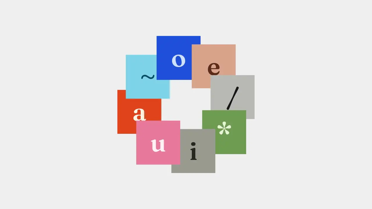
Use when a handful of cards, logos or photos must orbit one point and stay upright: a ring around a product, a halo of integrations, a carousel that never ends. Items sit evenly on a circle and turn as one wheel, linearly, forever. Clip: circling-elements.mp4. Demo: demo/circling-elements.html.
Credit: port of fancy by Daniel Petho, MIT. Source: circling-elements (repo). The keyframes and the demo are the original's.
All items are position: absolute in a zero size box at the circle centre, each centred on its own point (translate: -50% -50%). The transform is the original's: turn to the angle, go out by the radius, turn back by the same angle so the item stays upright.
The code
const RADIUS = 120, DURATION = 10, DIRECTION = 1;          // px of a 532 px tall box (scale by vh/532), seconds per turn, -1 reverses
const ease = (p) => p;                                      // "linear", the original default; any easing runs per turn
window.seek = (t) => cards.forEach((el, i) => {
  const offset = (i * 360) / cards.length;                  // start angle: even spacing
  const a = DIRECTION * (offset + 360 * ease(((t / DURATION) % 1 + 1) % 1));
  el.style.transform = `rotate(${a}deg) translate(${RADIUS * P}px, 0) rotate(${-a}deg)`;
});
Easing and timing
The clip runs 5 s. The look is vawe.
Notes
Eight 112 px tiles on a 120 px radius overlap by design: the later item in the list is on top. The direction is clockwise on screen (rotate grows clockwise with y down).
The numbers that make it look expensive
- 10 s per turn, linear: slow enough to read each tile, with no ease so the ring never seems to breathe.
- Radius 120 against 112 px tiles: the ring is almost closed, tiles touch their neighbours at the corners.
- 360 divided by the count: add a tile and the angles redistribute. Eight is the demo's count.
- With an easing each turn starts and ends slow: a stepped, ratcheting feel. Keep
linearfor a calm ring. - Hover pause is not ported (no cursor in a film).
The common mistake
Rotating the wrapper: the tiles turn with it and look upside down at the bottom. Keep the counter-rotation in the same transform. Also putting transform-origin somewhere other than the item centre.
Difference from the original: the tiles are lettered colour squares in place of the demo's photos.
Sound
Sound: none; or one soft tick per tile passing the top.
Related moves

See all 125 moves. Learn how a page becomes a film in the docs, copy chains of moves from the recipes, or read the motion guide.