CSS box
When to use
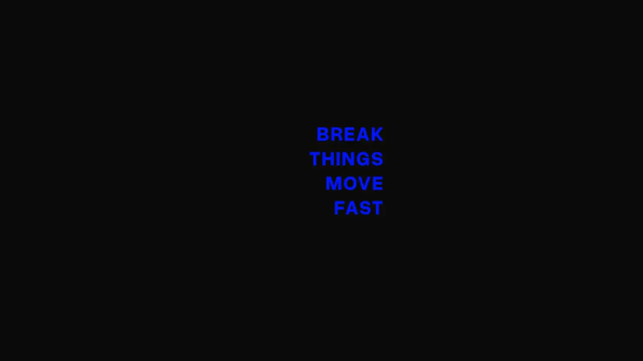
Use when a cuboid must turn to show another face: a product block with a message on each side, a cube that flips to the next fact, a tilt that lands on a face. The box rolls on a stiff, overdamped spring and stops with no overshoot. Clip: css-box.mp4. Demo: demo/css-box.html.
Credit: port of fancy by Daniel Petho, MIT. Source: css-box (repo). The geometry, the spring and the demo faces are the original's. The font is Overused Grotesk (OFL), the site's own.
Six absolute faces sit in one preserve-3d box inside a perspective: 600px parent. Each face is pushed out by half its depth. The whole box is pulled back by half the depth, so the front face rests on the screen plane.
The code
const STIFFNESS = 100, DAMPING = 30;                       // CSSBox defaults: motion useSpring, mass 1, damping ratio 1.5
const ROTATE_Y = [[0, 0], [0.6, 90]];                      // [second, degrees]: each key is one jump of the target
const ROTATE_X = [[0, 0], [2.0, -90], [3.4, 0]];
window.seek = (t) => {
  const x = track(t, ROTATE_X, STIFFNESS, DAMPING), y = track(t, ROTATE_Y, STIFFNESS, DAMPING);
  cube.style.transform = `translateZ(-${DEPTH / 2}px) rotateX(${x}deg) rotateY(${y}deg)`;
};
Easing and timing
The clip runs 4.6 s. The look is vawe.
Notes
Faces: front rotateY(0) translateZ(d/2), back rotateY(180deg), right rotateY(90deg), left rotateY(-90deg) (translateZ(w/2)), top rotateX(90deg), bottom rotateX(-90deg) (translateZ(h/2)); backface-visibility: hidden. A turn to a face is a jump of the target: Y +90 shows the left face, Y 180 the back, X -90 the top, X +90 the bottom. The original drags: a pointer move of 180 px is 90 degrees (pointer delta / 2). The spring is linear, so track sums one spring per jump and a new jump in flight keeps the speed, as the original does.
The numbers that make it look expensive
- Stiffness 100, damping 30, mass 1: damping ratio 1.5. A 90 degree turn is half done in 0.2 s and reads as done by 0.7 s, with no bounce.
- Perspective 600 px on a 200 px cube: strong enough that the side face skews while it turns, not so strong that it distorts.
- The cube is 200 x 200 x 200 and the text is 30 px bold with 0.05 em tracking, text only: no face fill, so the turn shows as type in space.
- Face text alignment differs by face (right and bottom, left and bottom, right and top): the lines swing about the cube, never about the screen.
- One axis at a time (Y, then X, then X back) keeps each turn legible. A diagonal jump works but reads as a tumble.
The common mistake
Using an eased CSS transition: it stops dead at each target and cannot take a second jump in flight. Use the spring on the angle. Also skipping backface-visibility: hidden (faces show mirrored through the box) and forgetting the translateZ(-depth/2) pull-back (the near face then sits closer than the screen plane and the box swells).
Difference from the original: the pointer drag is a time table of jumps (the spring is the original's). The original raises the spring stiffness to half while a drag is held, but that value is read only at render, so it never changes in practice and is not ported. The font is Overused Grotesk at the original sizes.
Sound
Sound: none; or one soft knock as each face lands (about 0.5 s after the jump).
Related moves


See all 125 moves. Learn how a page becomes a film in the docs, copy chains of moves from the recipes, or read the motion guide.