Weight morph

When to use
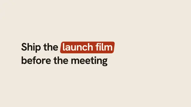
Use when one word changes its meaning on screen: a claim gets heavier, a name becomes the brand. The wght axis of a variable font is a real interpolation, so the glyphs reshape (stems thicken, counters close) instead of a fake bold from stroke or scale. Archivo carries 100 to 900; Anybody, Geist, Inter and Fraunces in assets/fonts do too. Clip: weight-morph.mp4. Demo: demo/weight-morph.html.
The code
@font-face { font-family: 'Archivo'; font-weight: 100 900; font-display: block;
             src: url('/assets/fonts/Archivo.woff2') format('woff2'); }
h1 { font: 200 18vh/1 'Archivo', sans-serif; letter-spacing: -0.02em;
     animation-name: thicken; animation-duration: 0.9s; animation-delay: var(--beat-1);
     animation-timing-function: var(--settle); animation-fill-mode: both; }
@keyframes thicken { to { font-weight: 900; letter-spacing: -0.04em; } }
Easing and timing
The clip runs 1.2 s. The look is swiss.
The clip uses one named ease from core/motion/presets.js. Each is a pair of After Effects handles: influence is how far along the segment the handle reaches, and speed is how fast the value moves at the key, as a multiple of the segment's average speed. Motion in the docs explains both.
| Ease | Leaving a key | Arriving at a key |
|---|---|---|
land | 12% influence, speed 4.8 | 75% influence, speed 0 |
Notes
<h1>weight</h1>
<script type="module">
import { EASE } from '../../core/motion/presets.js';
document.documentElement.style.setProperty('--settle', EASE.land);
</script>
Start at 200, not 100: a hairline at 100 vanishes against a dark ground and the first frames read as empty. Tighten letter-spacing with the weight (heavy type wants less air) so the word grows denser, not only wider. The @font-face must declare the range 100 900; with a single weight the browser synthesises bold and nothing morphs.
Looks (ground, type, radius, accent) live in demo/demo.css; this snippet keeps neutral tokens.
Sound
Sound: bloom at --beat-1; its low, slow body matches the word getting heavier (default gain).
Related moves




See all 125 moves. Learn how a page becomes a film in the docs, copy chains of moves from the recipes, or read the motion guide.